Made by
- Bhavya Budda - budda.b@northeastern.edu
- Jayanth Reddy Rachamallu- rachamallu.j@northeastern.edu
- Prachi Patel - patel.prachi2@northeastern.edu
- Rohith Kanakagiri - kanakagiri.r@northeastern.edu
Problem Setting & Definition:
Building emissions account for almost 28% of the world’s total greenhouse gas emissions. With the growing need of better regulating these emissions, the use of sensor technology to predict the number of occupants in the room and automatically manage the operations of a building to better suit the number of occupants would help the building operate more efficiently and reduce the emissions caused due to building operation. Apart from the environmental benefits of determining the number of occupants in the room, it has benefits on a more global scale as well. With the increase in covid-19 cases the world has seen in the past couple of years, small gatherings in closed spaces turned out to be the one of the key factors that fostered the exponential rise and spread of the virus. Predicting the occupancy and reducing the number of small gatherings will help curb the spread of any such future pandemics.
The goal of this project is to build a model to predict the number of occupants in a room based on data from light, sound, CO2 , temperature, and motion sensors fit in a 6m * 4.6m room. The sensor data was collected over the duration of 4 days. With this project, we try to classify the number of occupants into 4 pools (0,1,2 and 3) using Machine Learning techniques and algorithms.
Data Sources:
Data Description:
The dataset has 17 attributes, 10,129 instances, and 1 outcome variable. The 17 attributes are: Time: The time of the day at which the sensor measurements were taken in HH:MM:SS format S1-4 Temp: The temperature measured in degree Celsius at 4 different locations of the room S1-4 Light: The amount of light measured in Lux at 4 different locations of the room S1-4 Sound: The sound emitted measure in Volts at 4 different locations of the room S5_CO2: The amount of CO2 in the room in Parts per Million (PPM) S5_CO2_Slope: The slope of CO2 values taken in the room at a sliding window S6,7 PIR: Motion detection sensor in two different parts of the room.
Exploratory Data Analysis and Visualization:
Exploring data and displaying it in a visual form is an important tool to help tell us a story, making it easy to understand by highlighting trends and outliers. Removing excess noise, gives us a clear picture and helps enable us to draw coherent conclusions about the data. The dataset has no null values so we didn’t need to clean for missing values. We looked for correlated columns in the features and plotted a heatmap of all the features to do this.
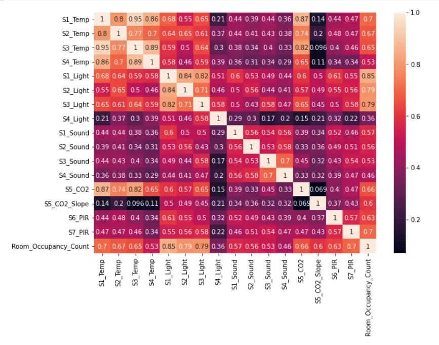
A visual representation of the correlation among the various factors is displayed above using a heatmap. The darker the color higher is the negative correlation, as indicated by the values as well and vice versa. Factors having a correlation greater than 0.85 are considered to be highly correlated.
The response/output variable for our project is distributed as follows
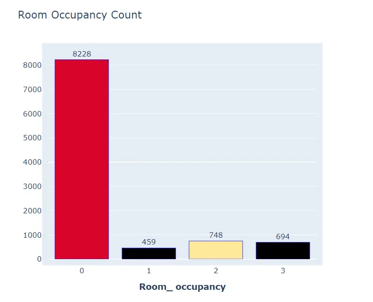
From the bar chart we can see that the records indicate 459 instances of when there was 1 person in the room, while there is a majority sweep of records of a count of 8228 which shows 0 occupants in the room with the least number of records of 459 with 1 person in the room.
Exploring the time variable to see times at which the occupants are most.
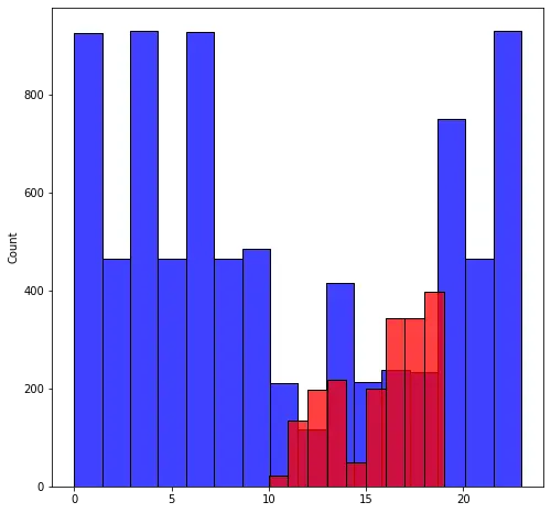
The above histogram is indicative of the popular times that the room was occupied. We can see that the busiest times were between 10 am and 7 pm which are regular business hours.
A few models work better with normally distributed features so checking the distribution of features. The below plot shows all 4 sounds columns are skewed to the left.

LDA or Linear discriminant Analysis is used for dimension reduction, classification, and data visualization. We used LDA to project the data onto a 2 dimensional plane and check for clusters.
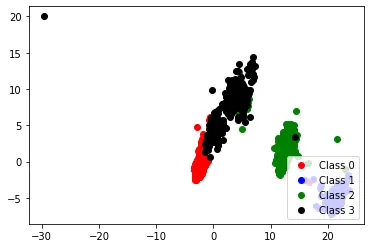
The data available to us can be clustered into different classes as shown above, which is indicative of its linearly separability and its ability to be utilized in exploring various machine learning classification models that work well with linearly separable outcomes.
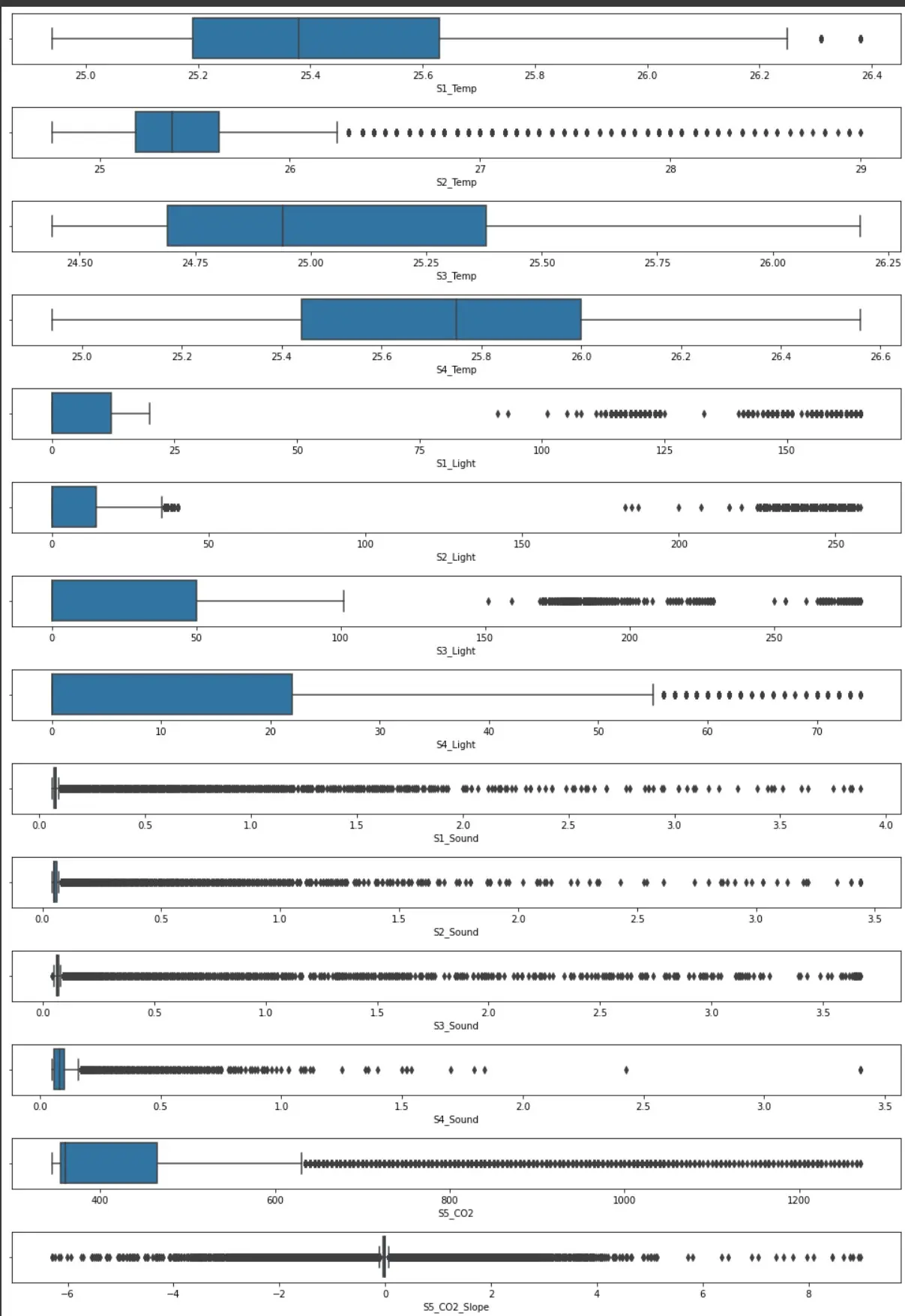
Checking for outliers using boxplots
Data Pre-processing:
Under sampling and over-sampling: Out of the 10129 values in the dataset, 8228 of the values belong to class 0. To correct the imbalance in the dataset we decided to under-sample the majority class (0), to a 1000 values, since most of the values very close to each other. After undersampling the majority class, we oversampled the other 3 minority classes using SMOTE(Synthetic Minority Oversampling Technique)-this is basically a technique where synthetic samples are generated for the minority class, and it helps to overcome the overfitting problem which can occur due to oversampling. Classes 1,2 and 3 were oversampled to obtain a balanced data set with 1000 samples each.
Data split: The data is split into 25% test set and 75% training dataset which is further split into 80% and 20% into training and validation data respectively.
Fixing skewness: The data at hand is heavily skewed to the left in the sound column, which was fixed using Box Cox tranformation, which is a transformation technique which transforms variables which are not normally distributed into a distribution close to a normal distribution. If our data is not normally distributed, applying Box-Cox transformation helps us run a broader number of tests.
Standardization/Normalization: The data was standardized by subtracting the mean and std deviation of the training dataset from the validation and testing dataset.
Dropping highly correlated columns: The collinearity is taken care of by dropping the highly correlated columns, which include S3_temp, S4_temp,S1_Light and S5_CO2. Highly collinear columns having a collinearity greater than 0.85 were dropped, as some models perform better with independent variables.
Encoding: The output variable consists of 4 classes (0,1,2,3), some models need this data in a binary encoded format so we encoded the output variable, ‘Room_Occupancy_Count’, into 4 columns (0,1,2,3) each column being 0,1 (binary values).
Outlier removal: The outliers were removed from two of the columns which were ‘S2_Temp’ and ‘S5_CO2_Slope’ as they were outside the 10-90 percentile range of the feature.
PCA for feature selection: Apart from the above transformations we also used data filtered with PCA to some models to compared its performance with and without PCA and select the best one. PCA was mainly applied due to its ability to produce independent features of smaller dimension. After performing PCA, we then printed out the number of principal components and the amount of variance they capture out of the total variance of the input features. From this we inferred that 9 out of the 16 columns capture 90% of the variance from our data, and 6 columns capture 80% of the variance in data. Apart from decreasing the dimensions PCA also helps reduce compute time, and helps reduce overfitting.
All these data preprocessing steps were incorporated into a class called Preprocessor with Boolean variables for each operation so that only the operations needed could be performed on the data while inputting the data into a model.
Model Selection & Implementation:
Considering the high correlation of a few of the features and the output variable and the linear separability that we observe after projecting our data on a 2d plane, we consider implementing the following models
- Neural Networks
- Logistic regression
- K nearest Neighbors
We need to split the data into training and testing datasets before we can go ahead with any model. We select our target variable as Room Occupancy and create a random state to make sure that all methods run in the same state. The models we are implementing is based on accuracy, the higher the accuracy, better the models perform. We split the data into 25% test set and 75% training dataset which is further split into 80% and 20% into training and validation data respectively.
Naive Classifier (Baseline)
We considered a naive classifier as our baseline model which classifies a new data point into the majority class of the training data. So in our case every new data point is classified as class 0 and we get an accuracy of 81.25% with such a model.
Neural Network
We used keras to implement a 2 layer neural network. We tried a few different parameters to improve the performance of the neural network. To keep the model simple and efficient we used 2 hidden layers and 1 hidden layer of various sizes and found that the model performed better with 2 hidden layers of sizes 16 and 8 respectively and an output layer of 4 layers. We used the ReLu function in our hidden layer 1 and hidden layer 2 because it is simple, fast, and empirically appears to work well. As compared to the sigmoid and tanh functions, ReLu performed better on the validation data set. For the final output layer we used a ‘Softmax’ function so that we get the outputs for different class labels.
.webp)
We used ADAM for the optimizer to provide an optimization algorithm capable of dealing with sparse gradients on noisy problems. We used the default configuration of ADAM with a change in learning rate to better suit out model. For the loss function we used categorical cross entropy to calculate the error and soft max to obtain the output because SoftMax is ideal for multi class classification. After trying various ranges of learning rates, regularization parameters, and number of epochs, a learning rate of 0.005, regularization parameter of 0.001 and 125 epochs resulted in the maximum accuracy on the validation dataset.
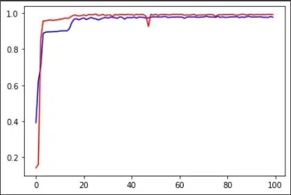
Epochs vs the training (blue) and testing accuracy (red)
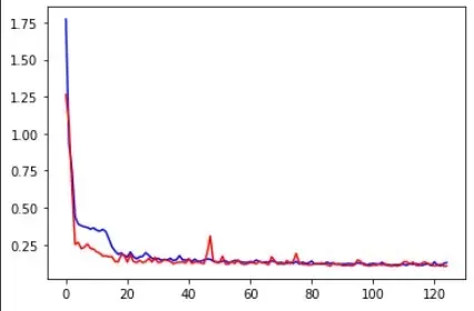
Epochs vs the training (blue) and testing error (red)
Multi class logistic regression
We used a SoftMax function because out output is a multiclass outcome with 4 classes. Similar to neural networks we used a categorical cross entropy loss function. To avoid overfitting we added a L2 norm regularization parameter.
We ran the logistic regression model on PCA (with thr first 9 components), PCA (with the first 6 components) and preprocessed non-PCA data. PCA (with the first 9 components) gave the best results on the validation dataset. We tried different values of regularization parameter coefficient, maximum number of iterations, and the learning rate to find the one which gives the best results on the validation set.
We got an accuracy of 89.46% with a learning rate of 0.0005 and regularization parameter of 0.01.
K Nearest Neighbors
KNN is a non-parametric algorithm, which means it makes no assumptions about the underlying distribution of the variables. We passed data which has been scaled and had its correlated columns removed, this is because collinearity effects distance-based algorithms. After passing the data, we tried alternate odd values of ‘k’ from 1 to 50 and plotted the first 10 on an elbow plot to obtain the k value which was giving us the least error rate on the validation data set.
Elbow plot to select an optimum K value from odd numbers between 1 and 20.
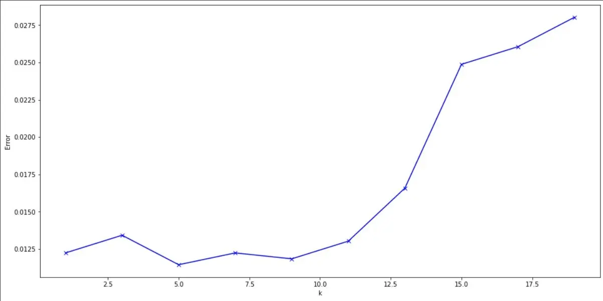
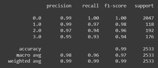
From the elbow graph k=5 has the lowest error so taking k=5 we get the following results
Project Results
After comparing the results of all the models, going by only accuracy the model performing the best was found to be K nearest neighbors, with a accuracy of 98.936%, followed by neural networks with an accuracy of 98.86%.
| ML Model | Accuracy | Training Time |
|---|---|---|
| Neural Network | 98.86% | 1 min 23 secs |
| kNN | 98.936% | 3 min 12 secs |
| Logistic Regression | 89.46% | 36secs |
But considering the training time for KNN as compared to Neural networks for the marginal increase in accuracy, neural networks would be the better choice out of the two.