Team Members
| Name | Email ID |
|---|---|
| Ashwin Kadam | kadam.as@northeastern.edu |
| Ashish Mhatre | mhatre.as@northeastern.edu |
| Harshad Jadhav | jadhav.h@northeastern.edu |
| Myron Aruj | aruj.m@northeastern.edu |
Outline
- Problem Statement
- Project Goal
- Data Description
- Data Exploration
- Feature selection and Statistical Test
- Principal Component Analysis
- Model Exploration
- Logistic Regression
- Naïve Bayes
- SVM
- K- Means Clustering
- Neural Networks
- Project Outcome
Problem Statement
Internet has played a vital role in spread of information around the globe. With the development and introduction of various new social media platforms the access to information has become very easy. Most of the people have developed a habitual behavior of absorbing the content or information through digital platforms for example learning through YouTube, Sharing thoughts and opinion through Twitter, Facebook, and Instagram. Also study has shown that people choose to read news through online news platforms rather than conventional way. Online news platforms provide an appealing and easy to digest news content. These digital news platforms hold important data such as news engagement, the ratio of likes and dislikes of news, and the number of shares. With the help of these data and various other contributing features, we can identify or classify the popularity and unpopularity of news. Predicting such popularity is valuable for authors, content providers, advertisers and even politicians. Predicting the popularity of online news is becoming a recent research trend.
Project Goal
In this project we will be using various machine learning algorithms and techniques to solve the above defined problems, we will be using classification algorithms to classify weather a news article will become popular or not. Apart from this we will also explore the data and find out the most contributing features to the news popularity. Finally, we will demonstrate several models and evaluate the best models based on performance metrics.
Data Description
The original data contains 61 features including URL, rate of positive words, title sentiment polarity and so on. And 39797 samples are provided. All the features are numerical except URL. Data collection period January 7, 2013, to January 7, 2015.
Data Source
Data Exploration
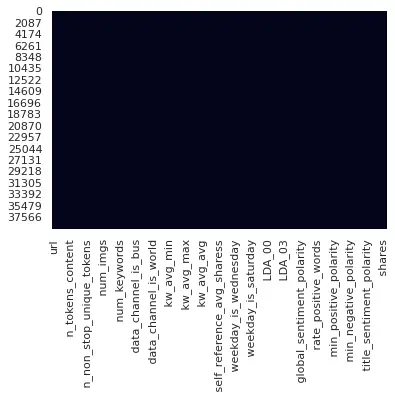
In data exploration, we are charting out histograms of all the features, to check the distribution of data. Also, we are plotting the boxplots of all the features, to check the outliers in the data. The data has been checked for null values and we haven’t found any NULL values in the data. The following figure represents a heatmap where NULL values are highlighted as we can’t see any highlighted cell, we confirm that there is no presence of NULL values in the dataset.
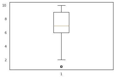
We can see in the fig 1 and fig 2 we have distribution close to a normal distribution which is desirable for our analysis. also in fig 3, we can see that feature num_keyword have a single outlier which suggests that the distribution of data is uniform, and we have less data points which lie at an abnormal distance from other data points.In this analysis we will keep the features having a distribution closer to normal distribution and with minimum number of outliers.
Figure 1: n_tokens_title
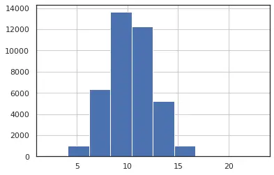
Figure 2: n_unique_tokens
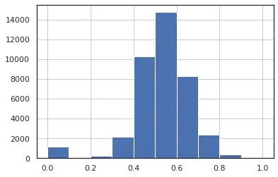
Figure 3: num_keywords
In second set of figures, we can see that for feature – num_videos, we have highly left skewed data that is 95% of data is falling in the range 0-5, which gives us very low variance. Also, fig 4 box plot for the same feature confirms the same and we see that there many outliers as well in this feature.
Figure 4: num_videos
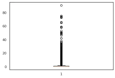
Figure 5: num_videos
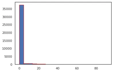
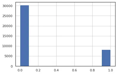
For the fig 6, we can see that this feature is highly left skewed with near 0 variance. Based on these facts , we decide to drop these features from our analysis, as these are highly left or right skewed data with very low variance or having large number of outliers.we can say that we have the distribution of the data between 0 and 1 which suggest that feature has only two discrete values (0,1).
Figure 6: weekday_is_monday
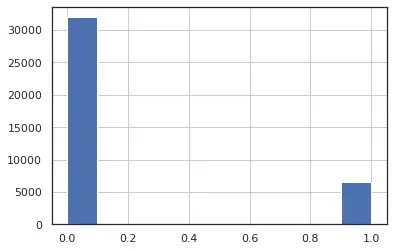
Figure 7: data_channel_is_world
Similarly, below are the list of discrete binary features.
These all featured will be exempted from normalization of data and outlier treatment.

Co-relation plot
Checking for correlation between the feature as if have two or more independent variables that are very highly correlated. we could run into the multicollinearity conundrum.
Figure 8: Co-relation plot:
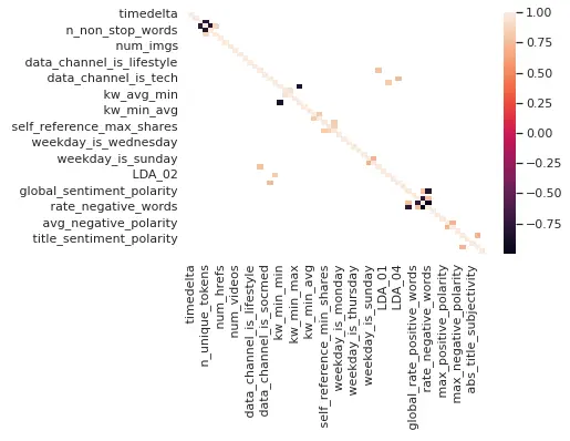
So in the above fig, we have calculated and plotted the covariance matrix, highlighted features represent the correlation coefficient which is greater than 0.7. We will be dropping all the highlighted features as these are highly correlated.
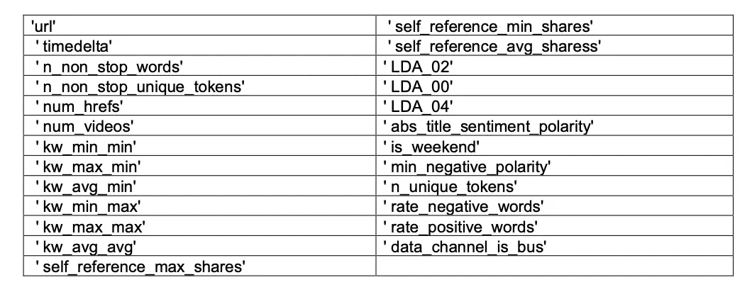
Feature selection and Statistical Test
Based on the study of distribution and outliers in the feature in combination with the correlation matrix we will be dropping the following set of features from our analysis.
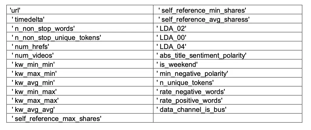
Total number of features dropped after EDA:- 25
Features remaining :- 36
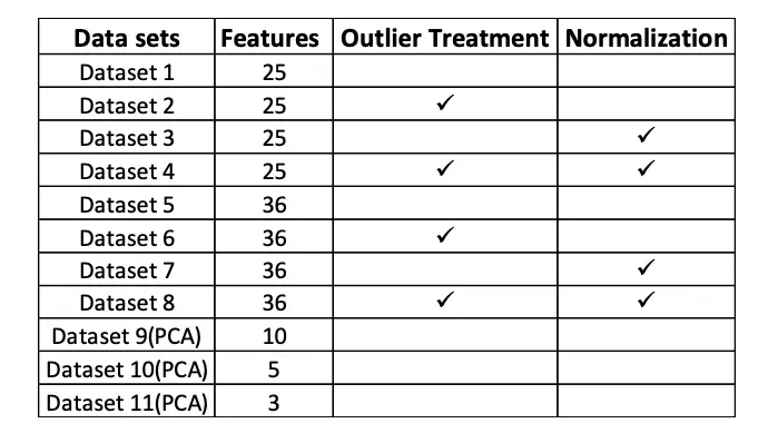
Performing outlier treatment and normalization on remaining continuous features of the data. Alongside raw data with 36 features we will be bifurcating dataset into 3 additional categories for further analysis.
- Data with Normalization and Outlier Treatment
- Data with Normalization
- Data with Outlier Treatment
We also Converted target variable to dichotomous variable with High and Low Share.
All values above 2000 to 1 and rest to 0 in Dependent Target Feature Shares.
Outlier Treatment
The interquartile range (IQR) is the difference between the 75th percentile (Q3) and the 25th percentile (Q1) in a dataset. It measures the spread of the middle 50% of values.You could define an observation to be an outlier if it is 1.5 times the interquartile range greater than the third quartile (Q3) or 1.5 times the interquartile range less than the first quartile (Q1).
Outliers = Observations > Q3 + 1.5IQR or < Q1 – 1.5IQR
Using IQR trimming we see that around 30,355 rows fall in outlier. Since we can’t drop these many rows,
we will move towards second approach which is capping
Outlier Capping
Capping in a sense is similar to trimming the dataset, but the difference here is, while trimming we used IQR or z-score and trimmed the data based on some IQR or z-score value. Here instead of trimming or removing the values from the dataset, we convert the outliers and bring them in the limit or range of our data.
Normalization
Normalization is generally required when we are dealing with attributes on a different scale, as it may lead to a dilution in effectiveness of an important equally important attribute (on lower scale) because of other attribute having values on larger scale. The goal of normalization is to make every datapoint have the same scale, so each feature is equally important.
Min-max normalization:- For every feature, the minimum value of that feature gets transformed into a 0, the maximum value gets transformed into a 1, and every other value gets transformed into a decimal between 0 and 1.
We plotted Histogram and QQ Plot to validate the normal transformation. We can notice that some features like Global_subjectivity have achieved near perfect transformation. While some features have minor improvement in their distribution.
Feature selection based on statistical testing
Splitting features based on similarity, usage, and domain knowledge for performing statistical test like Chi-Square and Logistic Regression to determine significant features.
We have performed Chi-Square test on all Categorical (Discrete Set of features) which are temporal_features and channel_features. For set having continuous independent features and dichotomous dependent variables we have performed a logistic regression statistical test to determine the significance of each feature in their respective sets and overall, in the model.
Chi-sqaure test of Independence
We have performed Chi-Square test on all Categorical (Discrete) Set of features.
The Chi-Square Test of Independence determines whether there is an association between categorical variables i.e., whether the variables are independent or related in this analysis we will be testing the significance of independent categorical variables like the temporal features and channel features.
We will consider the hypothesis as follows
- H0: The “temporal_features”/ ”channel_features” are independent of “Shares”(Target)
- H1: The “temporal_features”/ ”channel_features” are dependent of “Shares” (Target)
For this analysis we will consider a confidence interval of 95% and reject the null hypothesis if we get a ‘p value’ less 0.05.
Based on chi-square and p-value we identify the significant features.
Logistisic Model Test
The logistic model is a statistical model that models the probability of one event taking place by having the log-odds for the event be a linear combination of one or more independent variables.
Hypothesis for logistisc Model:
- H0: Feature X is independent of Target variable y
- H1: Feature X is dependent on Target variable y
For this analysis we will consider a confidence interval of 95% and reject the null hypothesis if we get a ‘p value’ less 0.05.
After performing the test on all the groups, we select the significant features from the respective groups and perform an iterative testing using all the features until we have all the features as our significant variables in the final iteration of logistic model. we see that we have around 24 features which are significant, and we will proceed with model building using these set of 24 independent variables along with a dependent variable “Shares.
Principal Component Analysis
Principal Component Analysis, or PCA, is a dimensionality-reduction method that is often used to reduce the dimensionality of large data sets, by transforming a large set of variables into a smaller one that still contains most of the information in the large set.
Reducing the number of variables of a data set naturally comes at the expense of accuracy, but the trick in dimensionality reduction is to trade a little accuracy for simplicity.
From PCA we will be selecting the components in the combination of 10, 5 and 3 for performing our analysis
Model Exploration
Once we have the intuition of the Data and some insights of our predictor variables. Next step is to
explore various Models. We have implemented the below models to understand the accuracy of each one of them and select the best performing one.
- Logistic regression
- Naive Bayes
- SVM
- K-means Clustering
- Neural Networks
Above explored models have tested on the following datasets.
Logistic Regression
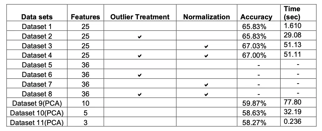
Logistic Regression is simple and intuitive algorithm which is easy to implement. While implementing Logistic Regression we made sure that data is free from any missing values and outliers. We implemented gradient descent and SGD to understand the difference between both the optimization techniques, also for logistic regression we converted the response variable into binary that is 1 or 0. We plotted the error to choose the best parameters and verified the same using grid search for hyper-parameter tuning.
The logistic function is of the form:

Accuracy
Naïve Bayes
It is a classification technique based on Bayes’ Theorem with an assumption of independence among predictors. In simple terms, a Naive Bayes classifier assumes that the presence of a particular feature in a class is unrelated to the presence of any other feature.
We have Implemented the below Naïve Bayes algorithm.
- Gaussian naive Bayes
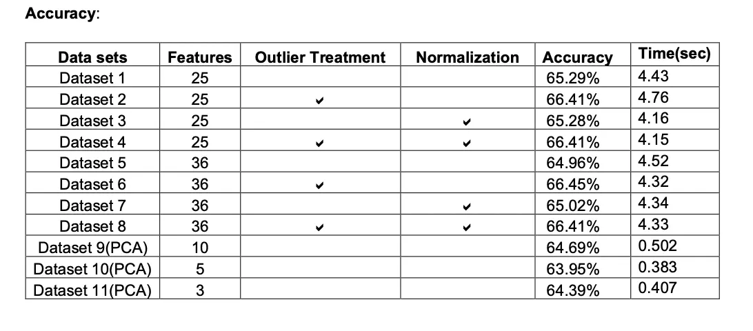
When dealing with continuous data, a typical assumption is that the continuous values associated with each class are distributed according to a normal (or Gaussian) distribution. We will be using the Gaussian naive Bayes model for training the continuous features of data and later we will multiply the probability of classes with the probability of Bernoulli naive Bayes which will be training on the discrete features of the dataset. We can multiply the probabilities with each other since each feature is independent.

- Bernoulli naive Bayes
In the multivariate Bernoulli event model, features are independent Booleans (binary variables) describing inputs. where binary term occurrence features are used rather than term frequencies.

SVM
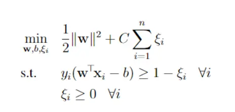
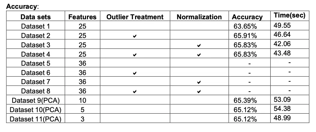
A support vector machine (SVM) is a machine learning algorithm that analyzes data for classification and regression analysis. SVM is a supervised learning method that looks at data and sorts it into one of two categories. An SVM outputs a map of the sorted data with the margins between the two as far apart as possible while keeping the distance between the data point and the margin minimum. Here, we used primal Soft Margin SVM, In SVM the response variable should be -1 or 1 as a result we converted the target variable to suit SVM’s need. A soft-margin SVM modifies the constraints from the hard-margin SVM by allowing some points to violate the margin. It introduces slack variables ξi, one for each training point, into the constraints. Here we have used SGD as our solver but for fast results we could use alternate solvers as SMO.
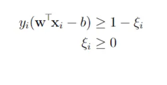
Putting the objective and constraints together, the soft-margin SVM optimization problem is:
K- Means Clustering
The K-means clustering algorithm computes centroids and repeats until the optimal centroid is found. It is presumptively known how many clusters there are. It assigns data points to a cluster such that the sum of the squared distance between the data points and the cluster’s centroid (arithmetic mean of all the data points that belong to that cluster) is at the minimum. The less variation we have within clusters, the more homogeneous (similar) the data points are within the same cluster. K-means implements the Expectation-Maximization strategy to solve the problem.
- First, we need to provide the number of clusters, K, that need to be generated by this algorithm.
- Next, choose K data points at random which will be the centroid for the clusters.
- Iterate the steps below until we find the ideal centroid, which is the assigning of data points to clusters that do not vary. a) The sum of squared distances between data points and centroids would be calculated first. b) At this point, we need to allocate each data point to the cluster that is closest to the others (centroid). c) Finally, compute the centroids for the clusters by averaging all the cluster’s data points.
Neural Networks
We have built our NN model using Keras.
Model in keras is defined as a sequence of layers and we can add layers until we achieve the desired model. When creating the first layer in keras we need to specify input layer the correct number of input features by passing the number of features in “input_shape” which in our analysis is 35 features (35,)
While the optimum exact number of layers and number of nodes are found through a process of trial-and-error experimentation we will initially proceed with 5 dense connected layers with an activation function as ReLU and Sigmoid Function for the output layer as we have a binary outcome variable. Our final model consist of input layer of 32 nodes an output layer with single node and 5 hidden dense layers with (128,128,128,64,8) nodes respectively with SGD optimizer and activation function as Relu.

Project Outcome
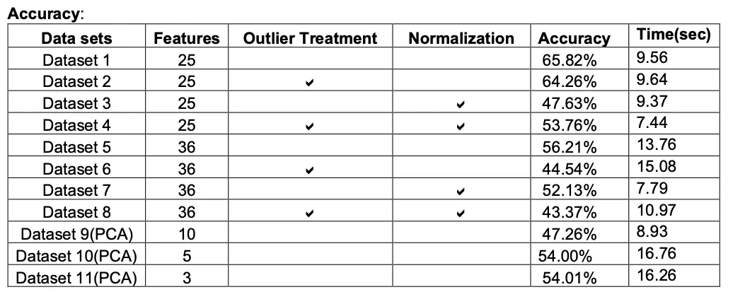
With the implementation of Multiple models we realised that Logistic Regression model gave maximum accuracy which is 67.03%.
With respect to computation timing of each model we see that naïve bayes took less time to run(4.15 sec) and accuracy of 66.41%, which is close to Logistic Regression model.
Model behave differently when we subjected to different number of features and in presence of outlier. Below tables gives a summary of it.

With respect to target variable, that is number of shares. We found out that the articles that we published on weekends are more likely to be shared. Also, by doing deep diving into other features we found out that articles that are related to entertainment and positive sentiment are more likely to share.