Outline:
1. Pipeline

Our real-time monitoring pipeline starts off by storing data that is used to call the predict.py function into a GCS bucket. BigQuery reads this data and makes it available to use to analyze using SQL. We connect BigQuery with Looker Studio to give us a Looker Dashboard to monitor Data/concept drift (if applicable)
2. Dashboard Setup
We developed a Monitoring Dashboard to actively track any alterations in our data and to monitor the concept of data drift. Our approach involves leveraging BigQuery to persistently store our input values. Subsequently, we connect Looker to BigQuery, enabling us to generate insightful charts from this stored data.
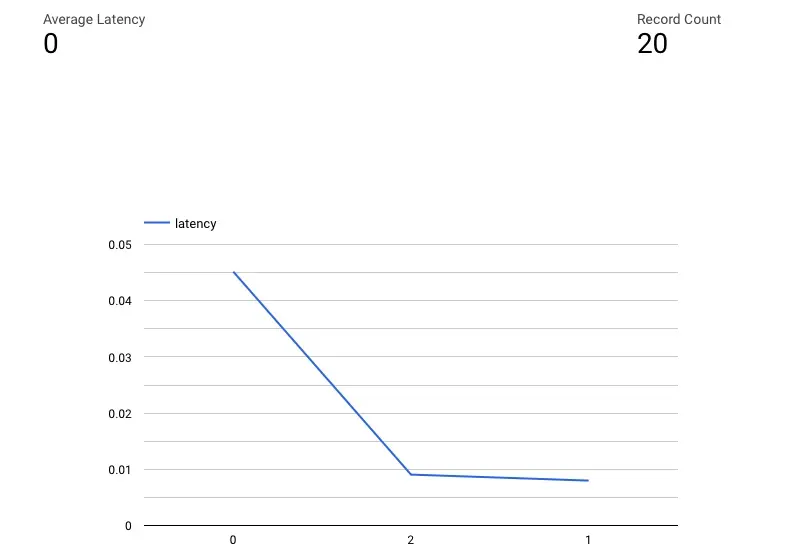
In addition, we have incorporated specific functions within our prediction module to capture and store vital metrics. These metrics encompass essential factors such as prediction latency, the minimum value of each feature, and the maximum value of each feature.
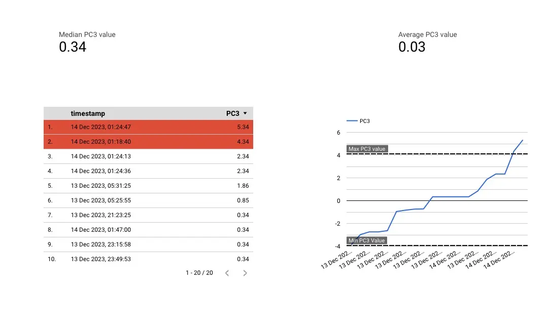
Our charts break down each feature by displaying not only the median value but also the average value. Additionally, we pinpoint any values that exceed the maximum or fall below the minimum, providing a visual cue for potential outliers. Beyond feature details, we incorporate a visualization highlighting the average latency associated with our predictions. This comprehensive approach not only enhances the clarity of our feature analyses but also sheds light on the average time it takes for our predictions to be processed.

From above charts we can see that 2 records have an outlier for PC3. The Max value for PC3 is 4.1 and 2 values are above that. Also, we can see that average value of PC3 is 0.03.
